Time Series (Supply Chain)
Time series are one of the most basic and versatile mathematical tools used in business. Quite simply, a time series consists of a series of data points indexed on time. A time series can thus model anything from the evolution of a company’s sales, to that of their product’s prices, on a yearly, monthly, daily or even hourly basis. Time series are particularly intuitive, making them ideal for describing, visualising, modelling and finally forecasting a number of variables.

Descriptive statistics with time series
The primary use for time series is descriptive. Time series can condense a large amount of information in one graph or table. However, as time series are particularly intuitive, people can easily oversimplify, or misread them. One source of misinterpretation is the time aggregate that the time series uses. Our calendar’s months are a somewhat arbitrary way of sectioning time and one shouldn’t be under the illusion that our months are homogeneous from a business perspective. Unequal numbers of days and weekends in a month can provide an explanation for what could first appear as discrepancies in the data. Other phenomena account for cyclicity in data variation. Holidays, such as Christmas or Black Friday, systematically cause spikes in sales for example, as do beginning of the month paydays. However, such cyclicity doesn’t necessarily fit our calendar. Traditions like Ramadan or the Chinese New Year cause cyclical variations in data though the cycle isn’t monthly or yearly. Furthermore, one must be wary of drawing hasty conclusions from time series or establishing overly simple correlations between graphs. It is thus important to bear in mind what distinguishes one variable from the next (sales from demand or from profits).
Visualising time series
Time series are also often used to read and visualize data, as well as compare different series. Once again, however, the pitfalls of such graphs lie in their apparent simplicity. Different mapping techniques can therefore be used to provide the best possible visualization of the data. For example, drawing lines between data points gives an impression of continuity. This can be useful when mapping for example the hourly evolution of stock prices.
However, in the case of particularly discontinuous data, a bucket graph can be more appropriate.
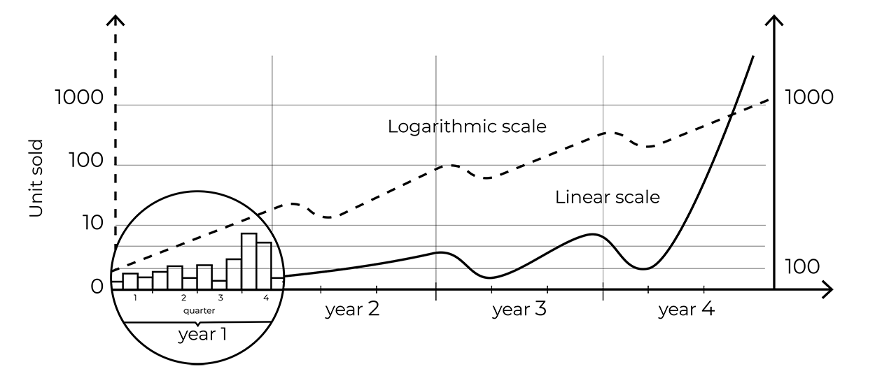
When reading a time series, one must also pay close attention to the x axis. Some graphs focus on small value intervals in order to emphasize data variations, with the risk being that these variations be overestimated. Other phenomena, such as exponential growth, are also misrepresented by a linear scale on the x axis. One can therefore choose to use a logarithmic scale where the early stages of growth can be perceived just as well as the later ones.
Modelling and forecasting
Time series are frequently used to support statistical models. The goal of those models is twofold: explain the past and predict the future. In supply chain, predicting future demand is required to determine purchase and production orders and to minimize the risks of overstocks. It is common to distinguish, within a time series, a primary level called the baseline, a long-term evolution called the trend, cyclical or periodic variations called seasonality, and other random variations we call noise. This allows us to distinguish data variations linked to regular cycles, from an underlying decreasing or increasing trend. These patterns provide the basis for economic forecasts.
There are three main types of forecasts, which each serve different purposes.
- Point forecasts intend to give the one “best” future value of a variable according to a specified error metric. Such is the case of a weather forecast for example, which for each day predicts a single temperature value. A point forecast doesn’t aim to faithfully represent this variable’s evolution (the reader knows full well that the temperature is likely to vary around its predicted value) but serves as a useful indication for the reader and a solid basis for their future choices.
- Probabilistic forecasts provide the full probability distributions of the future value. Confidence intervals are frequently used to visualize such forecasts. Such forecasts can for example be useful for speculative purposes.
- Generative forecasts make the variable’s evolution appear “natural” or “plausible”, allowing for a certain amount of contingency and random evolution. This “generative perspective” can be useful when running simulations.
The software ecosystem around time series
Numerous types of software are now used in order to take into account the complexities linked to time series and provide models or forecasts that best serve their user’s design. One can find databases, open-source tools, and even programming languages solely devoted to time series. Numerous forecasting methods have also been developed. For example, some software simply estimates future values with a moving average, whilst other types of software opt for exponential smoothing, meaning the weight of past values decreases exponentially as these values are farther away in time.
Time series are thus a particularly versatile abstraction and basic statistical tool. However, their apparent simplicity can be misleading. A number of factors can either alter the way the data is presented or account for noticeable variations in the data. Knowing how data is collected, and being aware of the aforementioned factors is therefore essential.