Modeling varying lead time
Yesterday, we discussed [why lead times were varying](/blog/2009/10/20/understanding-varying-lead-time/) in the first place. Let’s go further and see how varying lead times impact safety stock calculations.

Let’s start with qualitative insights of a lead time distribution. For the sake of simplicity, we are considering working days here to avoid week-end artifacts.
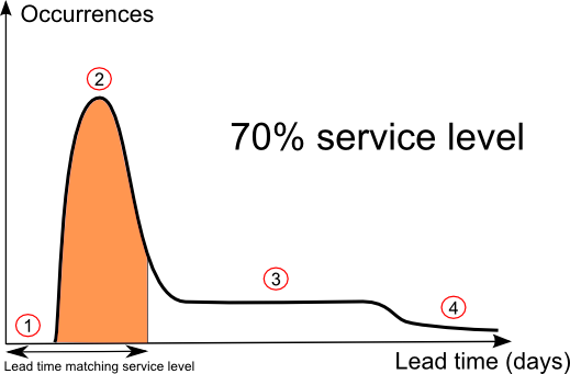
- The lead time distribution starts with a gap (illustrated by Point 1) that illustrates the minimal amount of time needed to perform shipping and transport.
- Then, there is the lead time mode which corresponds to the average shipping and transport time when the product happens to be available at hand in the supplier inventory. This mode is located at Point 2.
- If replenishment takes longer, it’s because the supplier has been encountering a shortage. As illustrated by Point 3, the lead time distribution is rather flat, and reflects the lead time mode of the supplier itself, that is to say the amount of time needed by the supplier to replenish its own inventory.
- Finally, there are rare situations where replenishment takes even longer (Point 4). This situation happens if both the supplier and the supplier of the supplier get a shortage of their own at the same time; or if there are disruptions at the producer level.
The safety stock model model proposed in our sample Excel spreadsheet does not take into account varying lead time. Yet, it happens that this formula can be adjusted in a simple way to take lead time variations into account.
If we assume supplier shortages to be independent for the ones of the retailer being replenished then, lead time should be adjusted to match the desired service level. Obviously, if the supplier supplies only one company, the retailer itself, this assumption does not make much sense; but it’s well adapted to the frequent situation where there are many retailers passing order to a larger wholesaler.
Visually, as illustrated in the schema here above, if the desired service level is at 70%, then the surface of the area colored in orange must represent 70% of the total area under the curve; that way the lead time ends up matching the desired service level.
Looking at the schema, it is clear that the higher the service level, the larger the corresponding lead time which is a rather reasonable behavior.
In order words, instead of handling the full complexity of the lead time distribution, we propose a mathematical trick where a single lead time quantile that matches the service level is used. This single value reflects the amount of uncertainties undergone by the retailer to ensure a certain level of service to its own customers.

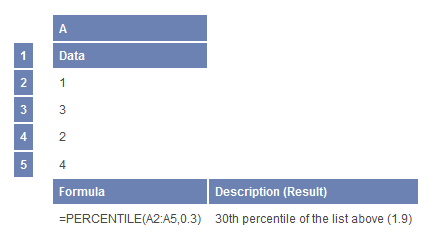
The good news is that Microsoft Excel does natively support quantile calculations through the PERCENTILE function. Thus, you can list all the observed lead times in an single Excel column and then apply the PERCENTILE function, the first argument being your list of observations, the second argument being the service level percentage expressed as a value between 0 and 1 (ex: 0.30 represents 30%).
Once you have computed this lead time quantile, you can inject the value as such into the Safety Stock Calculator. It will directly reflect the lead time variations into the reorder point calculation.

This analysis initiated with real-world eCommerce observations is leading us to interesting conclusions: in order to ensure high service levels, someone has to the take the financial hit as far inventory levels are concerned.
In our first schema, the orange area was illustrating a lead time associated to a 70% service level (numbers here are made up, it’s just for the sake of the explanation), but what happens if the retailer want to increase its service level?
Well, there is a threshold effect matching the service level of the supplier itself. In the present case, we have a supplier with a service level at 75%. This threshold is caused by lead time distribution itself that comes with a strong statistical mode.
If the retailer wants service levels below 75% (i.e. below the supplier’s own service level), then the matching lead times are small. Ex: 3 days for the real world example considered in the previous post.
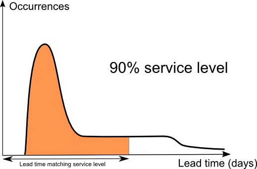
On the contrary, if the retailer wants service levels above 75%, then matching lead times are inflating very fast. This behavior is visually illustrated with the second schema displaying a 90% service level. As you can see, the duration of the matching lead time get more than doubled, which mechanically more or less double the amount of inventory as well.
As we were saying initially, high service levels - which increase sales along with customer satisfaction - do not come for free. In the end, a company in the chain ends up paying for that. Retailers need to be careful concerning service levels offered by their own suppliers, because the threshold effect that we just outlined radically impacts the amount of inventory needed to satisfy its own customers.
Reader Comments (3)
One answer to this issue is to have multiple suppliers. We typically have long lead suppliers that are lower in cost and then short lead suppliers that are higher in cost. We work with the long lead suppliers all the time but, if we have an unusual demand spike, we can always turn to our short lead suppliers. This gives us service level and low cost.
Paul (8 years ago)
Hello Jon, I would be pleased to address your question, but would you be kind enough to repost it on ask.lokad.com/ ? Thanks in advance,
Joannes Vermorel (8 years ago)
dear friends, how do you put the leadtime percentile into reorder point calculation R = D + σL * cdf(P) ? How do you handle “reflect the lead time variations” in your reorder point calculation? please help, thanks,
jon (8 years ago)


